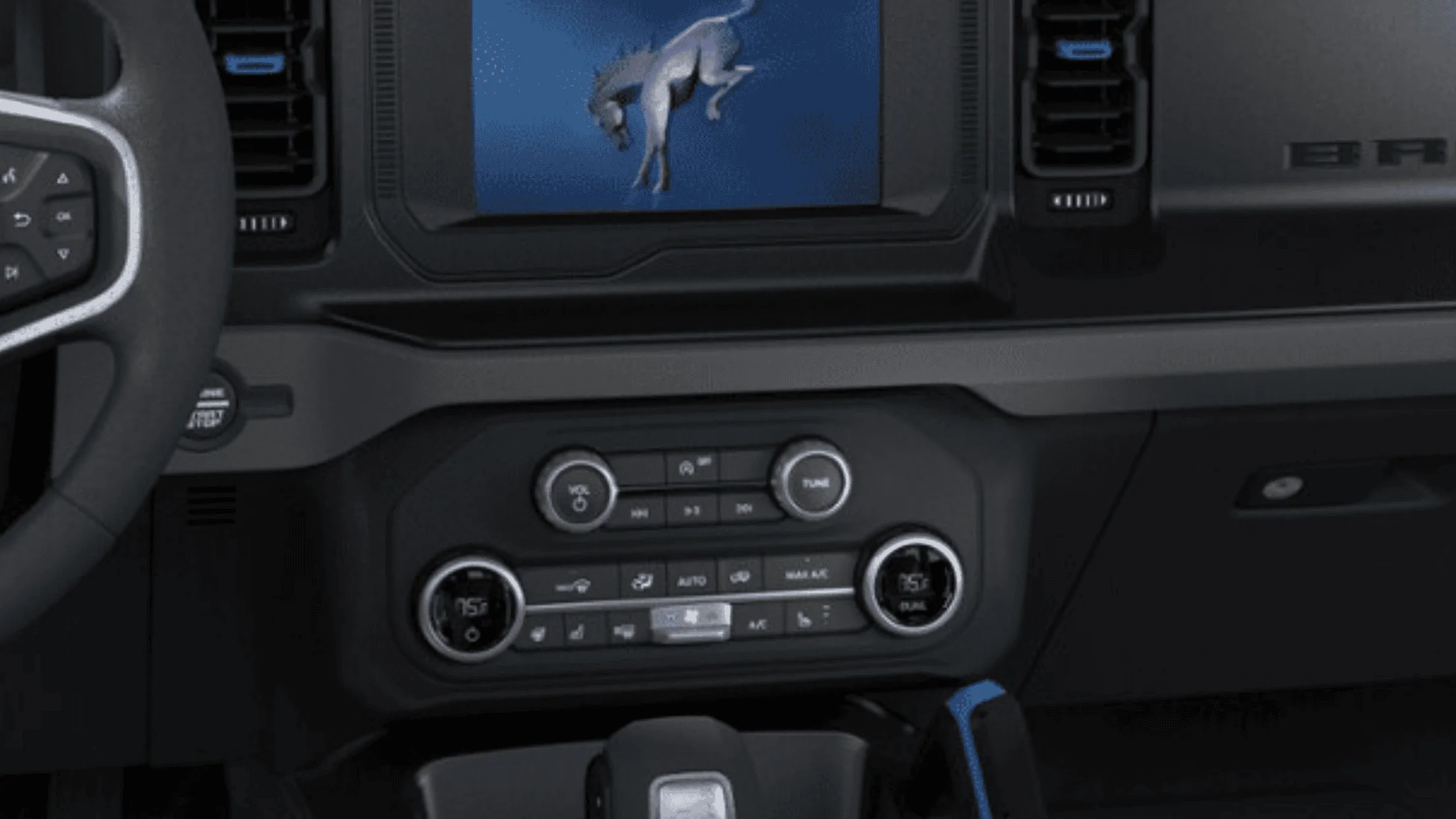
I'd agree. The layout looks like a complete afterthought. Looks like the notification bar on an old Android phone with icons just scattered everywhereThe very least they could have done is make them symmetrical. Either push them both to the corners of the screen or flip the time and driver temp. Awful design. I know most people won't care but I don't care about most people. Lol
Sponsored